When I was an art
student one of my professors insisted that we should use a limited palette of
colors; a strategy that many people advocate today. The concept is that you
learn the basics of color mixing with a reduced palette because it is less
confusing and you learn the particular way those colors react and mix with each
other in depth. From there you are then allowed to branch out and explore a
wider range of hues.
These teachers were
especially fond of warning us away from the usage of thalo green in favor of
viridian. They intoned, in hushed voices, that thalo green was much too strong
and intense for us mere beginners, no, we were to use viridian only. As a child
riding a bike may need training wheels, so we were to learn about the wonders
of green through the softer and more gentle hue of viridian instead.
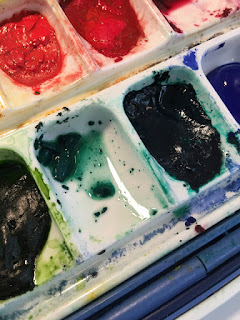
Thalo green, which
now comes in a red shade and a blue shade,
has a lively and intense quality to it. Some would say that it has a
“chemically” or unnatural look to it. It may need some toning down, so adding
an earth hue to it or a red may be necessary. It certainly gets the job done, with gusto. I
think that is what I like about it, its ability to work so well. If you work in
watercolor rather than oils, it is a staining color, so it doesn’t “erase” or
pick up when dampened as well as viridian or some other mix of colors would.
“Fixing” something that has gone wrong is more difficult. In oils, this is not
an issue.
Viridian, on the
other hand, is softer, more mellow. There is not the need to tone it down so
much. It has a somewhat “dusty” look to it, as if it was made for aerial
perspective. You must still add earth tones and mix it, as with all hues, but
not as aggressively. The finished painting may have a more “cohesive” look to
it, with very little effort. In watercolor, the pigment itself tends to get
“grainy” when re-wet from the palette, so if you keep a palette ready with
colors set out, you may find you need to discard and use fresh paint with each
session. Annoying.
What does this mean
for the painter? You have another tool to use and you may want to think more about
your subject, the lighting, the time of day, and the effect you are going for
to determine which is a better fit.

